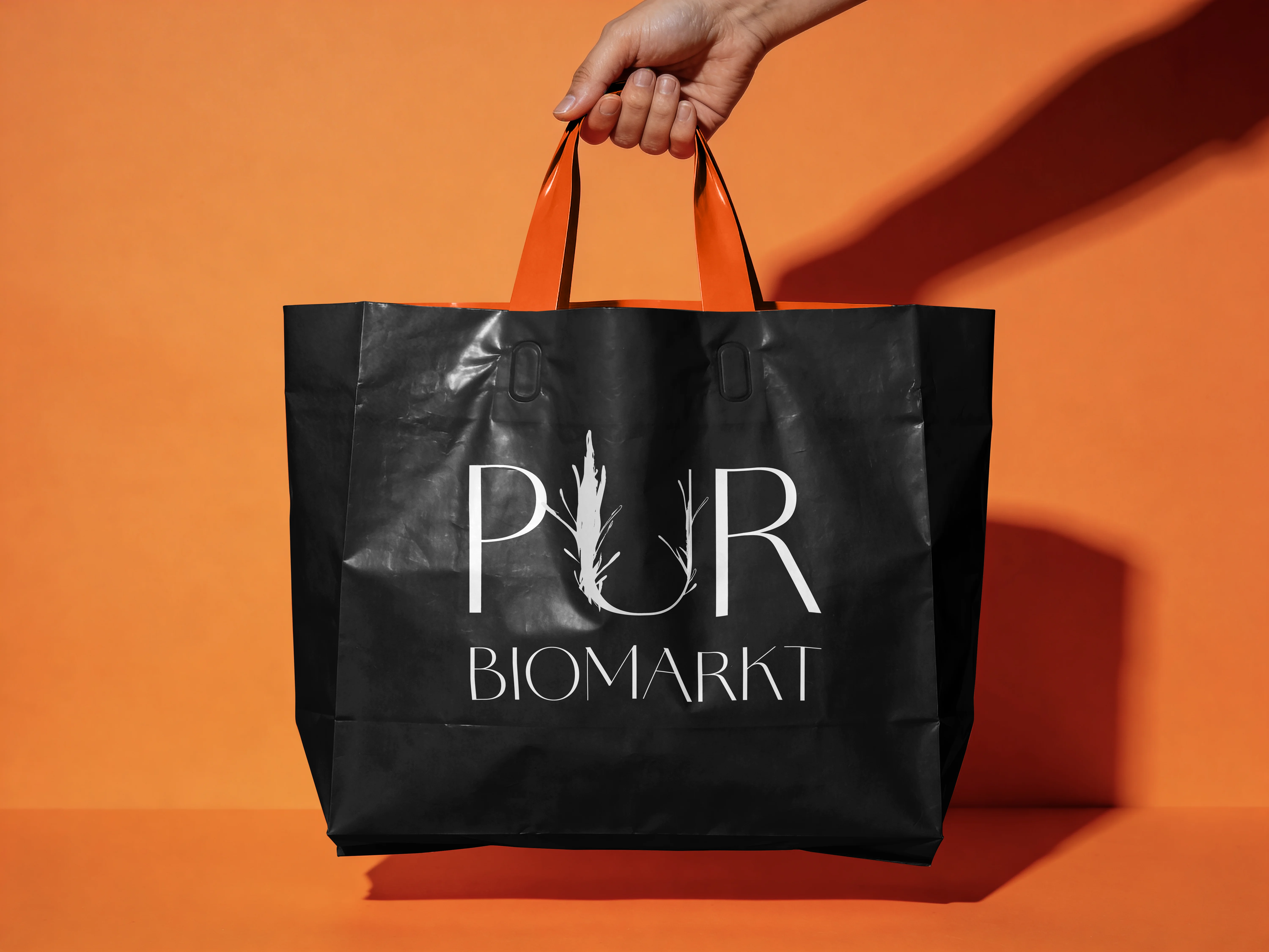
PUR Biomarkt Tote Bag
Brand Identity / 2025

Organic.
Without The Cliché.

A conceptual identity system for a contemporary organic supermarket designed for aesthetically aware urban consumers seeking quality, calmness and elevated everyday rituals.

01

Positioning & Direction

PUR Biomarkt was envisioned as a more refined alternative to the expected visual language of organic retail.

Instead of earthy clichés, handcrafted nostalgia or overt “green branding”, the identity leans into restraint, elegance and clarity.

The system combines monochrome minimalism with subtle organic gestures inspired by natural growth, texture and imperfection — designed to feel contemporary, elevated and quietly premium.

Brand Identity Art Direction Logo Design Packaging
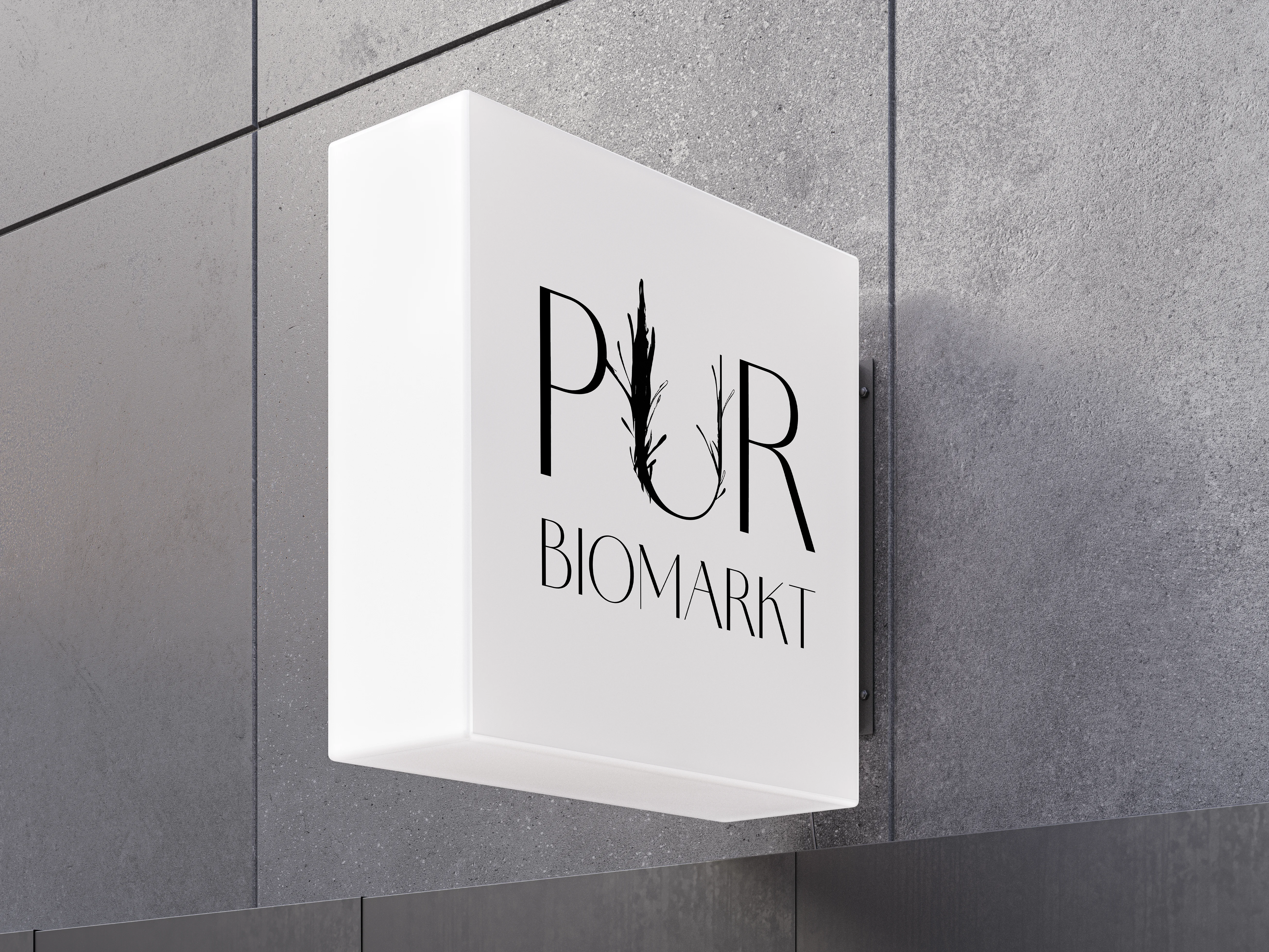
PUR Biomarkt Lightbox
03

Concept Development

Growth As A Symbol

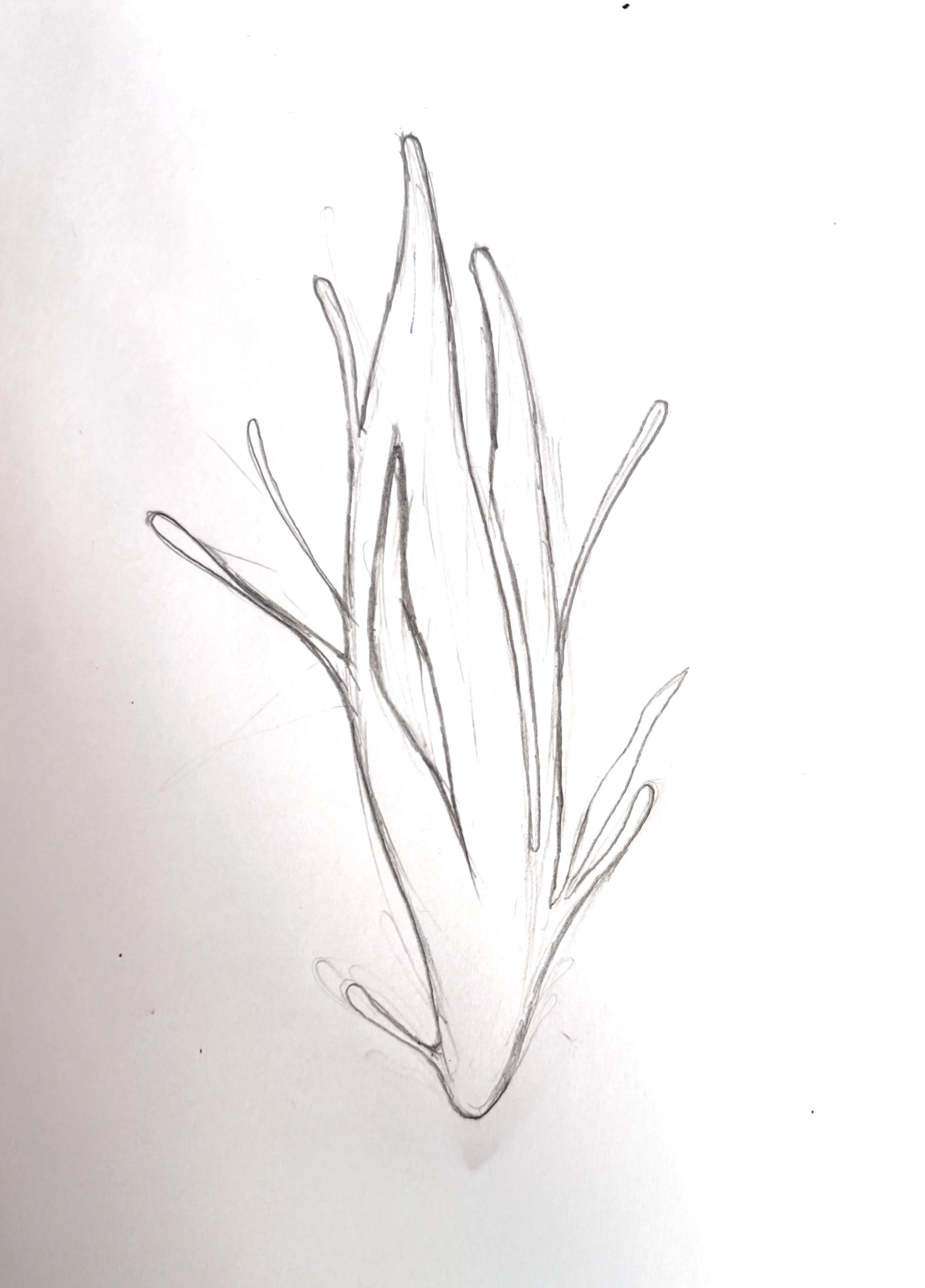
The hand-drawn organic element integrated into the “U” originated from early sketches exploring growth, fragility and natural movement.

Rather than using obvious ecological symbolism, the identity introduces a more abstract botanical gesture — creating emotional texture without overwhelming the typography.

04

Archived Direction

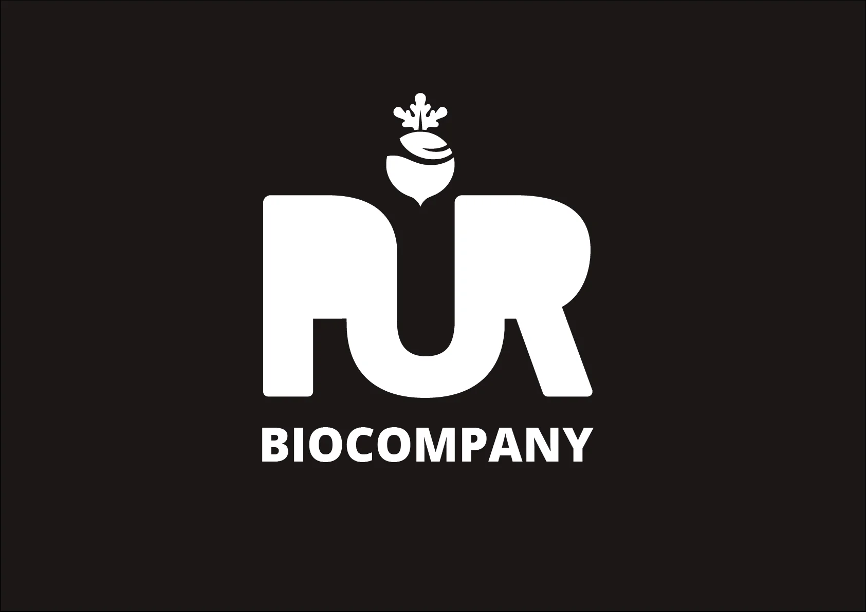
An alternative direction explored a bolder, more geometric approach with stronger mass-market energy.

While visually effective, the final chosen identity offered greater emotional sophistication and aligned more closely with the intended positioning of PUR as a premium, design-conscious biomarket concept.

Selected Brand & Identity Projects