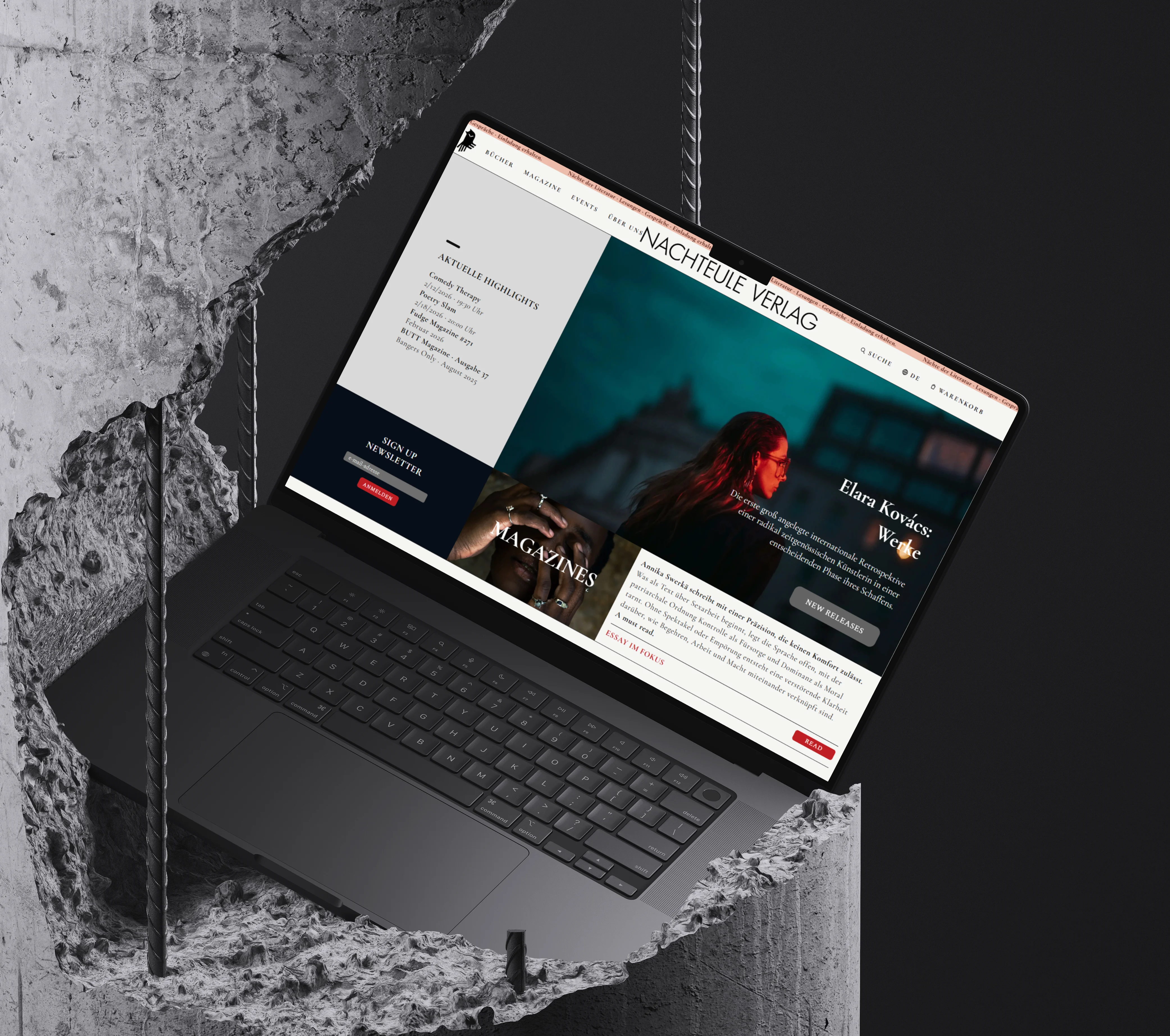
Editorial Identity / 2025
Independent Publishing.
Berlin After Dark.
A fictional Berlin publishing house shaped by literature, queer culture and the atmosphere of late-night intellectual life.
A fictional Berlin publishing house shaped by literature, queer culture and the atmosphere of late-night intellectual life.
Nachteule Verlag was imagined as an intimate yet culturally influential independent publisher rooted in Berlin’s literary, artistic and underground scene.
The concept combines the elegance of traditional publishing with the visual tension of contemporary editorial culture — balancing serif typography, rigid layouts and atmospheric imagery.
Inspired by independent art publications and curated bookstores such as Do You Read Me?! , the identity embraces both intellectual restraint and progressive cultural expression.

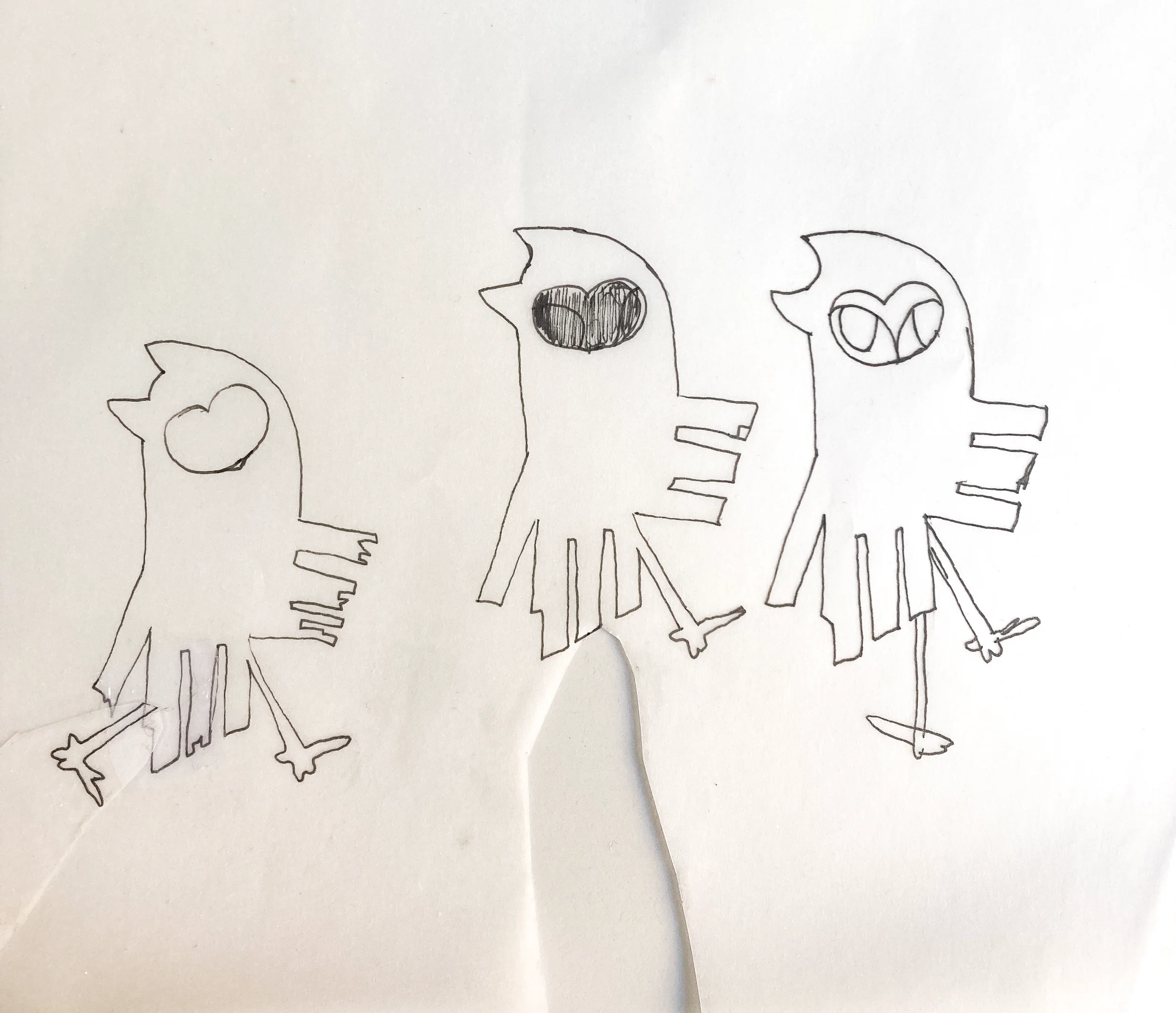
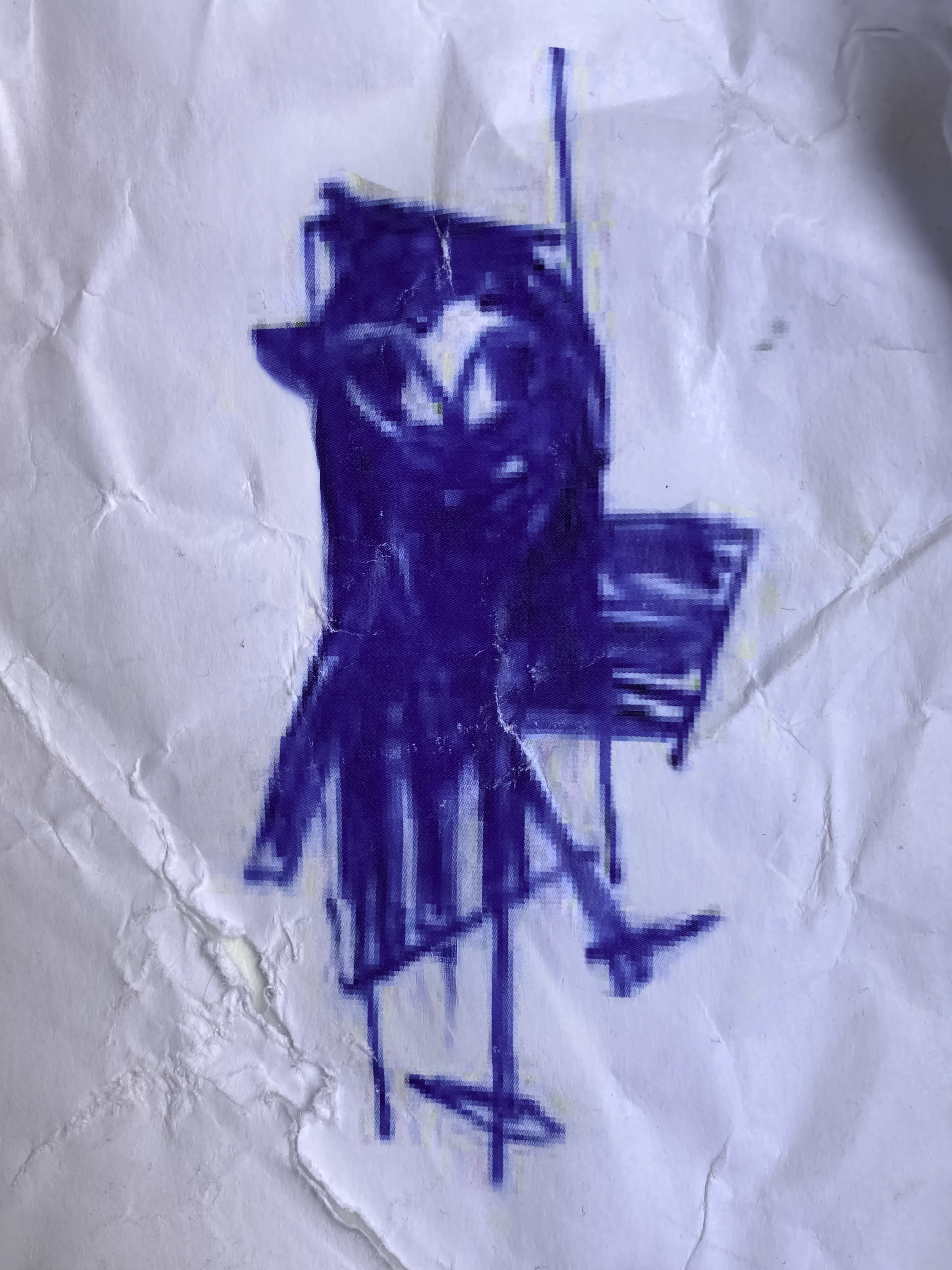
The final owl mark evolved through a series of loose hand sketches, balancing symbolic clarity with a deliberately imperfect, childlike charm. The process focused on creating a character that felt intelligent, slightly mysterious and human — avoiding the cold precision of overly corporate publishing identities.

The website structure was designed to resemble stacked editorial layouts — inspired by bookshelves, literary archives and tiled print systems.
Serif and sans-serif typography intentionally coexist throughout the identity to reflect the tension between heritage publishing and modern independent culture.
View Live Website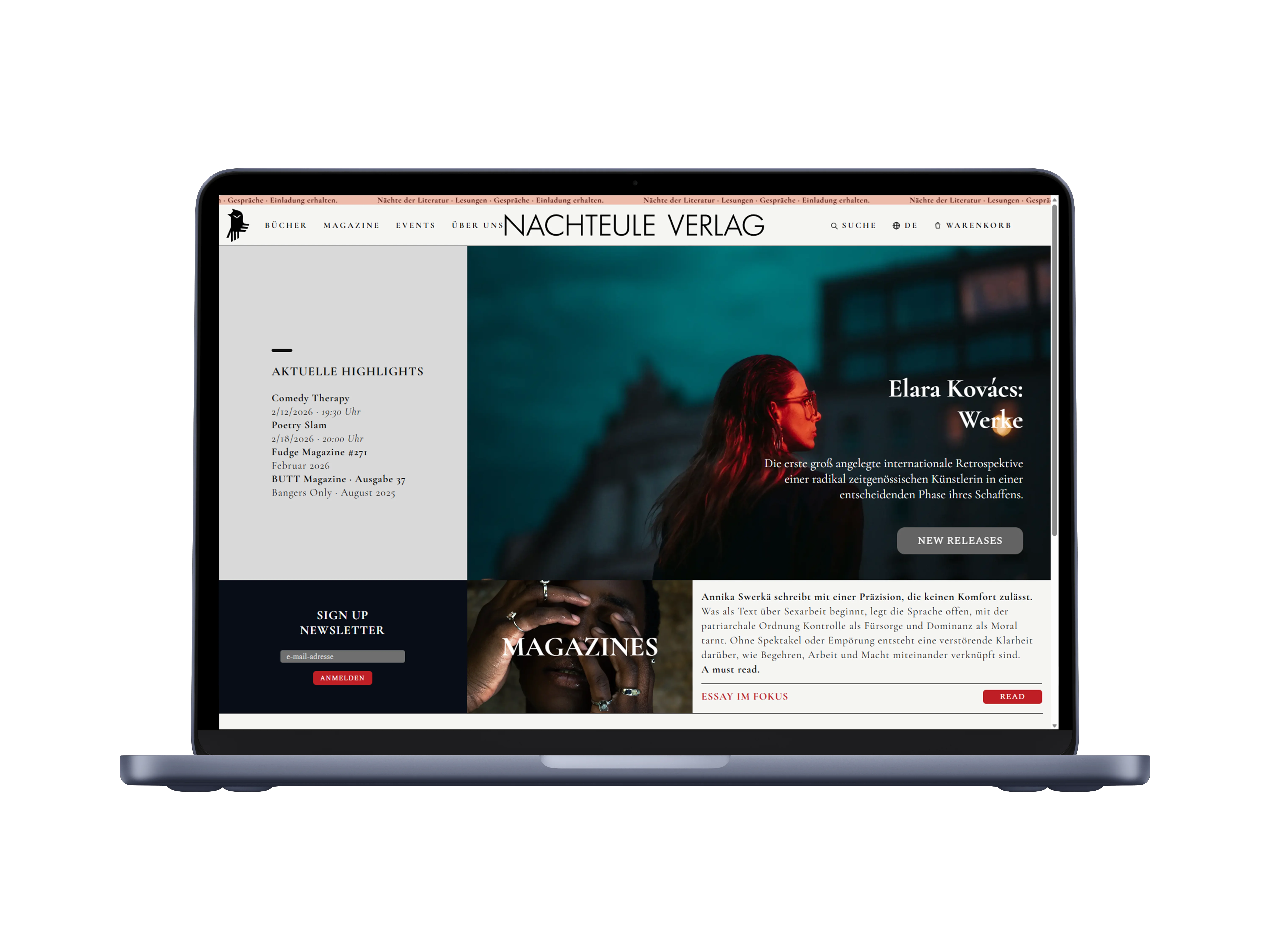
Beyond publishing books, Nachteule Verlag was imagined as a living cultural platform hosting readings, poetry slams, comedy nights, release events and experimental discussions.
The visual direction leans into late-night Berlin — quiet luxury, concrete textures, editorial restraint, warm paper tones and cinematic darkness.
The result is an identity system designed to feel intellectual, emotional and culturally layered rather than overtly commercial.